In Power Lines, journalist Peter Keating brings together nearly 100 political maps, tracing how cartography has shaped borders, asserted power and influenced how we see the world
Maps don’t simply show us the world — they can shape how we understand it. In Power Lines, journalist Peter Keating brings together nearly 100 political maps across the centuries, tracing how cartography has shaped borders, asserted power and influenced how generations see the world. From maps dividing territories to those depicting political threats, the collection reveals how lines on paper can have consequences far beyond the page…
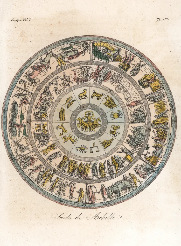
Homer’s mythical Shield of Achilles depicts cities, landscapes, agriculture and the heavens. This interpretation was created by Angelo Monticelli for an 1842 edition of Giulio Ferrario’s Ancient and Modern Costume. Image: Florilegius/Alamy Stock
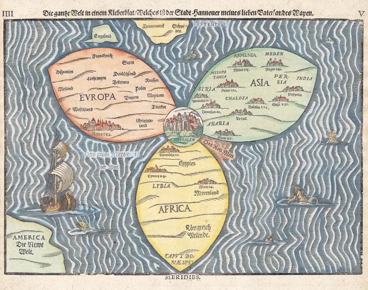
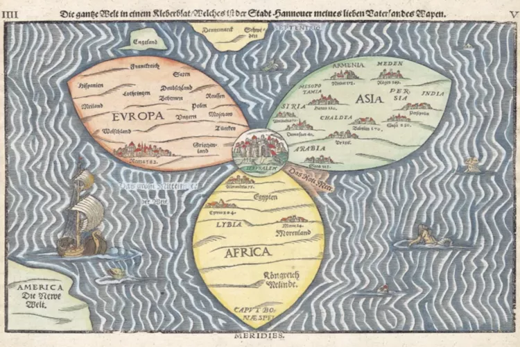
Heinrich Bünting’s 1581 cloverleaf map places Jerusalem at the heart of the world, with Europe, Asia and Africa forming three leaves — a striking reflection of the Christian worldview of 16th-century Europe. Image: Gibson Green/Alamy Stock
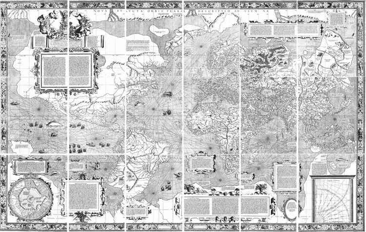
Gerardus Mercator’s groundbreaking 1569 world map introduced a new way of representing the spherical Earth on a flat surface. Designed for navigation, its projection became hugely influential — despite the dramatic distortion of landmasses towards the poles. Image: Art Collection 3/Alamy Stock
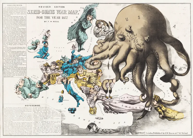
Fred W Rose’s Serio-Comic War Map for the Year 1877 transforms Europe’s geopolitical tensions into caricature. Russia dominates as a menacing octopus, Germany and France face each other armed for conflict, Britain looks on from across the Channel, while Ireland contemplates home rule. Image: Cornell University/Pj Mode Collection of Persuasive Cartography
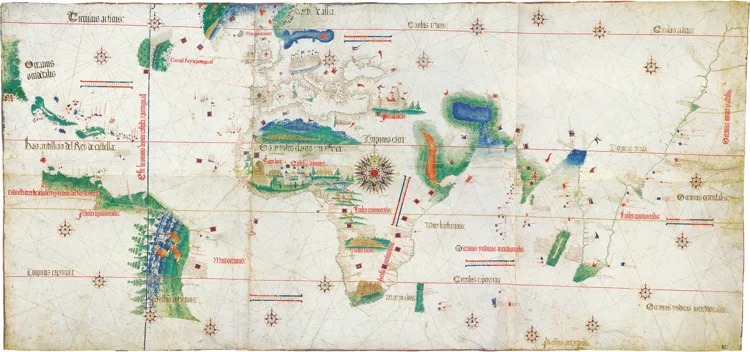
The Cantino planisphere, published in 1502, depicts a world being divided between European powers. Its bold meridian reflects the 1494 Treaty of Tordesillas, which apportioned newly claimed lands between Spain and Portugal, while colourful illustrations of birds, animals and landscapes fill its continents. Image: Heritage Image Partnership Ltd/Alamy Stock Photo
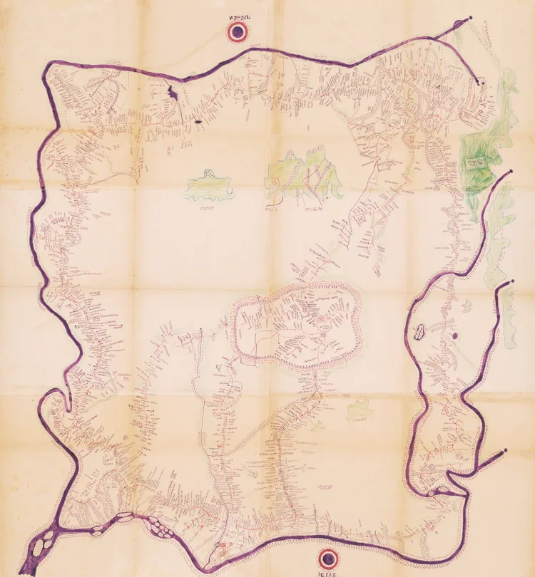
Created around 1920 by Sultan Ibrahim Njoya, Lewa ngu (The Book of the Country) is the oldest-known full-scale map of Bamum, now part of Cameroon. Njoya used vivid colours, distinctive symbols and a writing system of his own invention to map his kingdom. Image: Geography and Map Division of the Library of Congress
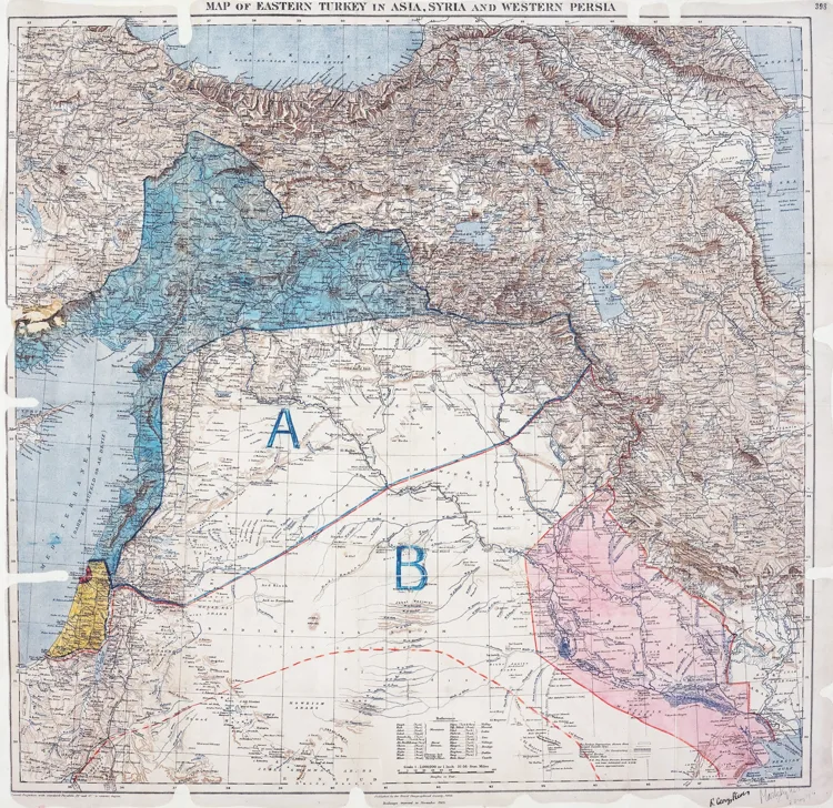
The 1916 Sykes–Picot map reveals how Britain and France planned to divide much of the Middle East between their spheres of control. Blue marked French control and red British, while areas A and B denoted zones of indirect French and British influence respectively. Image: National Archives
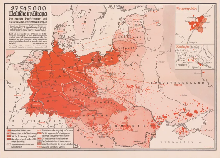
A Nazi propaganda map showing German populations across Europe in red, using demographic geography to support claims for territorial expansion. Image: Cornell University, PJ Mode Collection of Persuasive Cartography
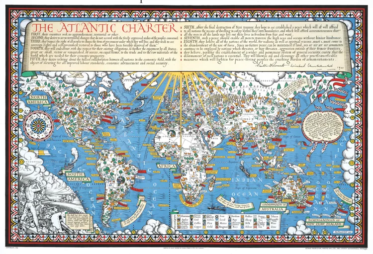
Created in 1942 by artist and cartographer Leslie MacDonald Gill, this map celebrates the Atlantic Charter, agreed by Franklin D Roosevelt and Winston Churchill the previous year. Its principles looked towards a postwar world founded on self-determination and international cooperation. Image: Bill Waterson/Alamy Stock
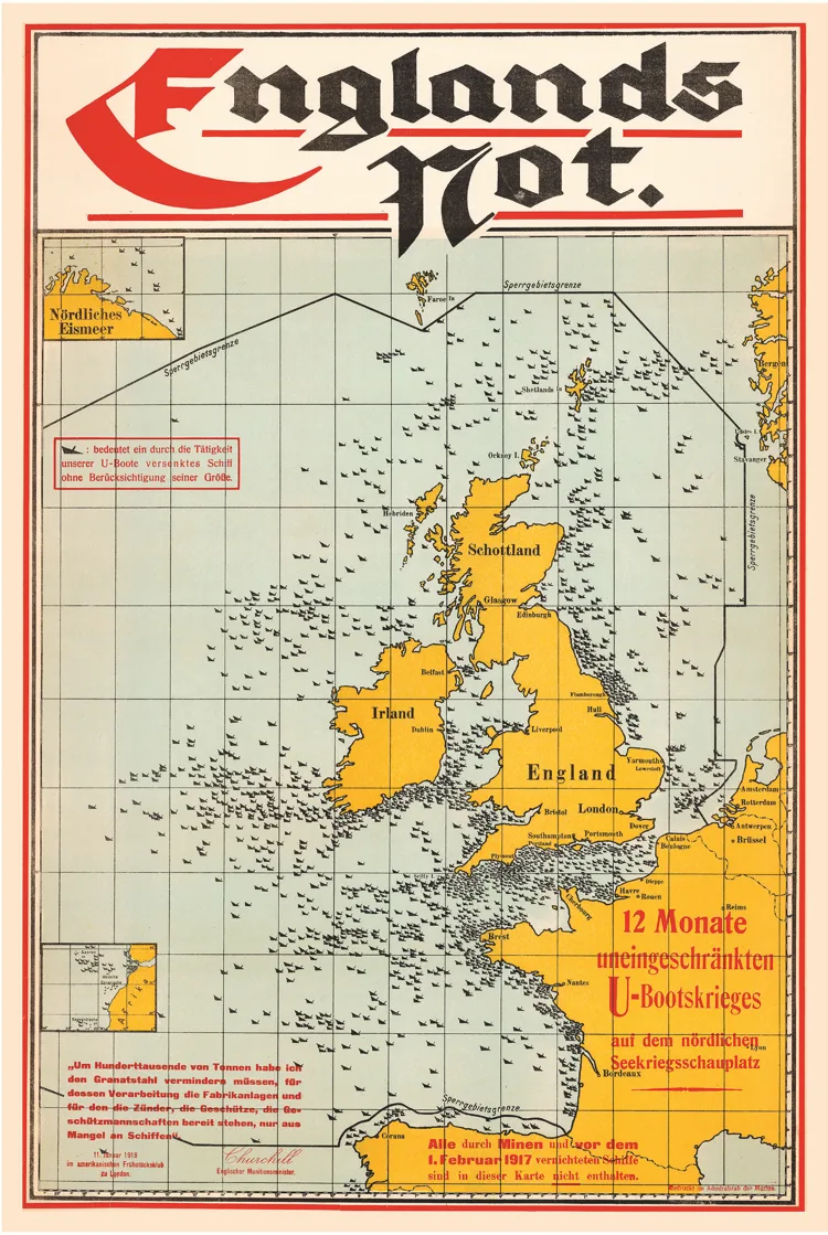
Produced by the German naval staff during the First World War, England’s Misery maps the impact of Germany’s U-boat campaign around the British Isles. Hundreds of ship symbols mark vessels sunk since unrestricted submarine warfare began in February 1917, turning the map into a striking piece of wartime propaganda. Image: Shaw Shots/Alamy Stock