From those depicting the devastation of rising sea levels to displays of population density across the world, these maps will challenge your world view…
By
Maps help us define our place on the planet. Their influence is of great magnitude, helping to shape an understanding of our place among hundreds of other countries and territories, and keenly assert our position on the various continents that comprise the world.
But many of us are likely familiar with just one type of map – the Mercator projection. While it may be excellent for navigational purposes, its drawbacks are plenty.
Enjoying this article? Check out our related reads:
It significantly distorts the size of landmasses, particularly near the poles, leading to a misinterpretation of the actual size of continents. For example, Africa appears much smaller than it actually is compared to Europe and North America.
Here we present five alternative maps of the world, many of which will likely reshape your understanding of our planet and the countries, territories and continents it comprises.
Hobo-Dyer Projection world map

Designed to reshape perspectives, the Hobo-Dyer world map was commissioned in 2002, and drawn by cartographer Mick Dyer. It was created to provide a more equitable representation of the world, reconsidering the traditional idea that wealthier, northern countries are given more space on a map in comparison to poorer, southern countries.
The main feature of the map is that it maintains equal area properties. Essentially, this means that the size of land masses on the map is proportional to their actual sizes on Earth. As such, this makes it easier to represent the relative size of various continents and countries.
It also subverts typical map presentations of ‘north’ being at the top.
Extreme poverty
Extreme poverty is defined as living below the International Poverty Line of $3 per day. The map above helps to visualise this disparity, and is measured in international dollars at 2021 prices.
The most affected countries are the Democratic Republic of the Congo, with 85.3 per cent of its population living in extreme poverty, alongside Mozambique (82.2 per cent) and Central African Republic (71.6 per cent).
Sea level rise map
Since 1880, global sea levels have risen by 8 to 9 inches. Now, the rate of rise is accelerating – more than doubling from 0.06 inches per year in the 20th century to 0.14 inches per year from 2006 to 2015. Such acceleration can be attributed to thermal expansion of warming oceans, alongside melting glaciers and ice sheets.
To accurately map the impacts of rising waters, Climate Central have created sea-level rise and coastal flood maps based on peer-reviewed science in leading journals. Outside of the US, the maps available are based on global-scale datasets for elevation and tides as well as sea level rise projections.
Through the map, it’s easy to see the devastation that future sea-level rise can wreak upon coastal communities.
Population density
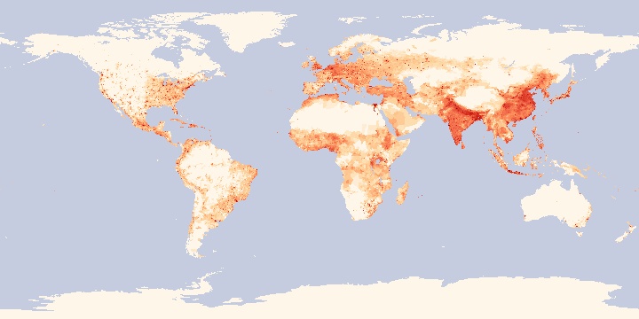
In the map above, red denotes high population density, while yellow and eventually white denote low population density. The darker the red, the more people – and the lighter the colour, the fewer.
The map is divided into numerous small grids, with each grid box approximately one kilometre in length and width. In addition to this, the red dots scattered around most countries show cities, where many people live in a small area.
Energy consumption
The data above is from information collated by the US Energy Information Administration in 2025. Figures are measured in kilowatt-hours per person.
Some of the countries with the largest energy use per person are Qatar (214,520 kWh), Singapore (180,700 kWh), Bahrain (164,940 kWh), Iceland (159,700 kWh) and the United Arab Emirates (138,030 kWh).