Flattening our spherical planet onto a 2D surface has always been a tricky endeavour. A new, double-sided projection of the world map seeks to minimise the resulting inaccuracies
By
The problem of how to depict the curved surface of the Earth on a flat map has troubled cartographers for centuries. There are many ways of doing it, but they all have downsides.
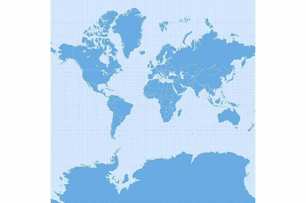
Take one of the most famous: the cylindrical Mercator projection, used by Google Maps. Devised by the Flemish geographer Gerardus Mercator in 1569, it prioritised navigation for sailors and enabled sailors to identify the shortest distance between two points. However, this made it less effective for anyone seeking to grasp the relative size of Earth’s landmasses – countries further from the equator are famously stretched, with Antarctica appearing bigger than everything else combined. It’s also difficult to establish distance at the edges of the map where the Pacific Ocean is split. Japan and Hawaii look very far apart, but the distance between the two is actually 6,625 kilometres, not much further than the 5,830 kilometres that separate Hawaii and mainland USA.
More useful to those uninterested in setting sail is the Winkel Tripel projection, which is often used in magazines. Created by German cartographer Oswald Winkel in 1921, it represents the poles more accurately, but there’s still some distortion and the same issues apply to the Pacific.
Stay connected with the Geographical newsletter!
In these turbulent times, we’re committed to telling expansive stories from across the globe, highlighting the everyday lives of normal but extraordinary people. Stay informed and engaged with Geographical.
Get Geographical’s latest news delivered straight to your inbox every Friday!
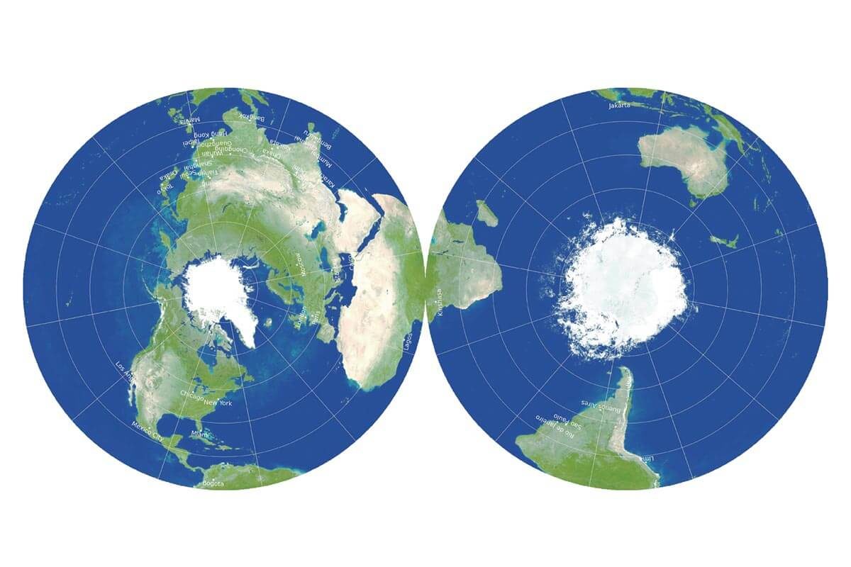
A group of astrophysicists has sought to at least partially solve these problems with a new projection. The two-sided image was designed to minimise six types of distortion that flat maps can introduce: local shapes, areas, distances, flexion (bending), skewness (lopsidedness) and boundary cuts (continuity gaps).
It builds on previous work by two members of the team, J Richard Gott, an emeritus professor of astrophysics at Princeton University, and David Goldberg, a professor of physics at Drexel University, who in 2007 used these six categories to invent a scoring system for maps in which lower numbers represent less distortion. Applying the scoring system to their new map (created in collaboration with Robert Vanderbei, a professor of operations research and financial engineering) results in a score of 0.881, the lowest of any world map the researchers are aware of. Under the same system, Winkel Tripel gets 4.563 and Mercator 8.296.
An example of the Mercator projection
There are still small errors in both local shapes and areas, but because it seeks to minimise all six distortions, rather than optimising one at the expense of the others, the researchers claim that overall accuracy is better. They say that distances are off by no more than 22.2 per cent, while areas at the edges are only 1.57 times larger than at the centre.
The map can be displayed in two ways, with either the Eastern and Western Hemispheres on the two sides, or the Northern and Southern Hemispheres (as above), which allows the equator to run around the edge. ‘Our map is actually more like the globe than other flat maps,’ Gott said. ‘To see all of the globe, you have to rotate it; to see all of our new map, you simply have to flip it over.’
Subscribe to our monthly print magazine!
Subscribe to Geographical today for just £38 a year. Our monthly print magazine is packed full of cutting-edge stories and stunning photography, perfect for anyone fascinated by the world, its landscapes, people and cultures. From climate change and the environment, to scientific developments and global health, we cover a huge range of topics that span the globe. Plus, every issue includes book recommendations, infographics, maps and more!


