The way maps are created can have a significant impact on the way we view conflict, as shown by the war in Ukraine
By Doug Specht and Alexander J. Kent
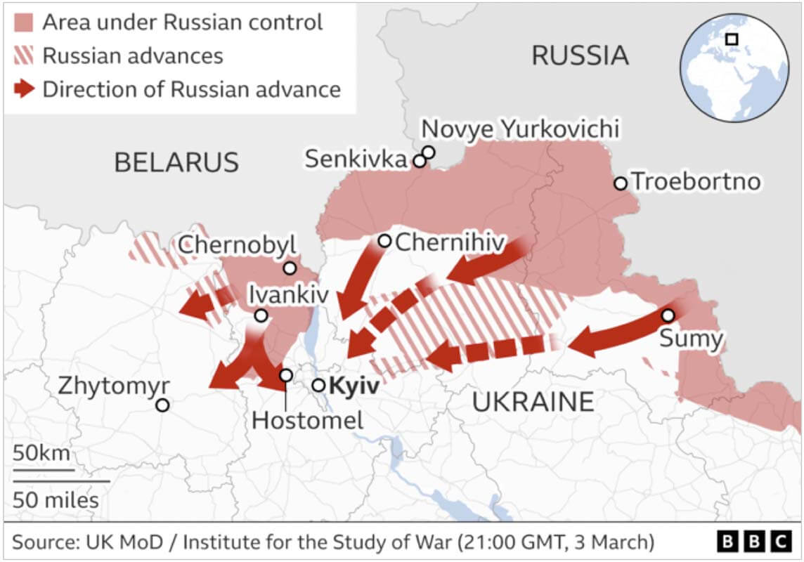
Maps fight a good war. As a means of conveying the spatial elements of conflict, such as the movement of troops and their control of territories, they offer an immediate and effective visual summary. The war in Ukraine has stimulated the production of hundreds of maps across various media, including newspapers, television and websites, each pertaining to indicate the status on the ground to a wide readership.
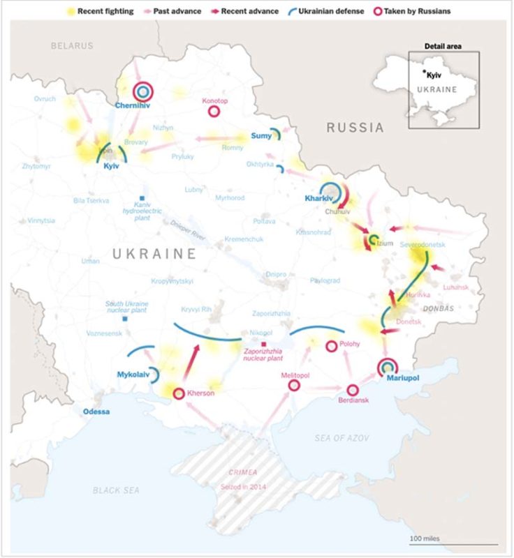
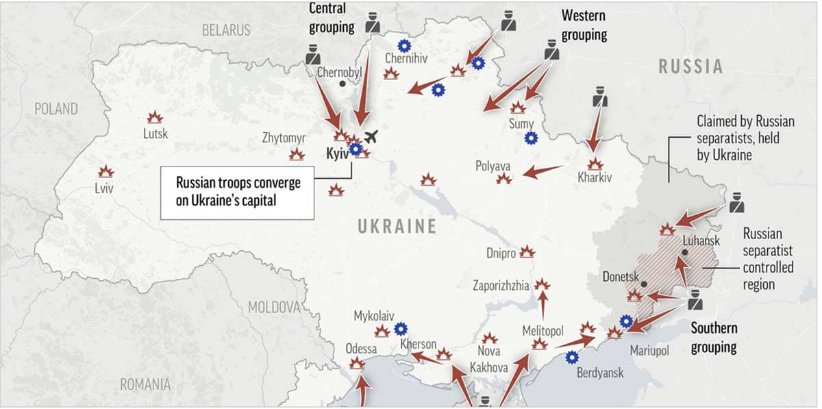
Although media outlets produce their own maps, these exhibit several similarities. Russia’s territorial gains are usually depicted in red, whereas its disputed territories are shown with hatching in the same colour. Arrows are routinely used to indicate movements of people – whether troops or refugees – and a myriad of symbols has appeared, representing bombs, nuclear power stations, destroyed cities, or specific battles. In addition, many areas are annotated with phases such as ‘occupied territory’ or ‘under Russian control’.
Aside from their unrivalled ability to communicate space and place, maps are also amongst the most trusted graphical devices. They present their subject with a sense of objectivity and ‘unauthoredness’, so that we believe they only present us with the truth – even during a complex conflict. A closer look reveals that not all is as it seems, however. Cartographic design choices over colour, layout, lettering and symbology, for example, all influence our attitudes and feelings towards the war in Ukraine.
Colour
Colour has enormous expressive power in cartography and carries perhaps the greatest impact on our initial impression of a map. Stronger or darker colours tend to catch our attention first and particular colours also have certain connotations – to Western map users, red suggests danger (associated with blood and heat), whereas green implies health (vegetation and growth). Hence, the colours used to depict troops and territories can affect how we view the conflict in Ukraine.
Most of the maps published recently in the media depict Russian forces and their territorial gains using red, with its connotations of threat and violence. The use of red also provides historical associations with the Red Army and the Soviet Union, renewing fears of the threat posed by the Cold-War superpower.
By emphasising the sense of danger, these maps portray Ukraine as a victim; a vulnerable sovereign state that has been violated by acts of Russian aggression. Nevertheless, they also imply that this menace is greater than recent curbs to Russian military gains would suggest. By contrast, green has been introduced on many maps to indicate Ukrainian counterattacks and their efforts to ‘neutralise’ the (red) Russian threat.

Territory
Depicting territorial changes in a fast-moving conflict is difficult, and is made even more so when an invading force is reliant on roads. Although large areas of eastern Ukraine have been coloured red to signify that they are under the control of the Russian military, this generalisation – or homogenisation of space – is misleading.
With most of the advancing Russian forces confined to road networks, very little contiguous territory is actually occupied beyond these axes of travel. Hence, many of the areas coloured red on maps are not actually under Russian administration. Moreover, even where Ukrainian military forces are absent, civilian populations continue to resist.
The graphical consistency on maps – according to how data are classified – is a legacy from mapping on paper and reflects the limitations of that static medium. Oversimplification, while familiar to all map users, cannot adequately reflect the dynamic nature of the invasion or the sporadic attempts to encircle and capture cities. Territories are rarely similar – whether topographically or thematically.

Arrows
As a well-known graphical device for indicating movement, arrows have been used liberally on maps of the Russia-Ukraine war as a method for depicting advancing troops or fleeing civilians. While they are also useful for indicating distance and direction, arrows can have particularly negative connotations when they are used to portray the movement of people.
The power of the graphic lies in its connotation of aggressive and deliberate movement. As such, an arrow can imply a threat to a destination, whether its subject is a body of refugees or an invading army.

Symbology
Maps themselves are symbols of what they show. Within the map, symbols are used to portray a variety of features that might include churches, playgrounds, walking routes, roads or museums. Recently, maps of Ukraine in the news media have shown key strategic military goals, e.g., large cities, nuclear power plants, and airports. Where these are attacked or captured, their symbols are sometimes replaced with one that resembles an explosion.
These appear as if they are a checklist of objects; explosion symbols over cities operate rather like the blocks of red territory by depicting sites that has been completely destroyed and masking the nuances of resistance and control. Such symbols offer an efficient means of conveying information about the general pattern of conflict on a small-scale map, but they also have a dehumanising effect that removes people from the horrors of war.

Power and resistance
Maps can represent a range of data associated with the conflict in Ukraine, yet many of these are concerned only with the achievements – movements, captured towns, and strategic assists – of Russian power in its ‘special military operation’. Other maps, which aim to indicate the flow of refugees out of Ukraine, present the country as something of a transitional and even vacant space, that Russians enter and Ukrainians leave. Few maps in the news media show Ukrainian resistance, although some recent examples have begun to indicate counter-attacks.
The absence of Ukrainian resistance can therefore make Russian achievements appear to be more advanced and certain than they are on the ground. The choice to create small-scale, country-level thematic maps also limits the portrayal of smaller towns and villages, masking the true experience of thousands caught up in the conflict outside the major cities. In short, the drive for clarity can result in making a complex, multi-theatre war look straightforward with an inevitable outcome.
As more maps of the war in Ukraine continue to be produced by the news media, their authors struggle with the challenge of conveying the complexities of a dynamic and unpredictable conflict to a wide audience. Maps are abstract representations that help us to comprehend the changing global landscape, but none can fully represent the truth and all are governed by the essential cartographic choices of what to show and how to show it.
However, by understanding how these choices (e.g., regarding the selection and classification of features as well as their colour and symbology) mask the nuances of reality, we can be better at reading the stories they are trying to tell. Consequently, mapmakers and map readers alike can better understand – and ultimately mitigate – the human tragedy of this war.
Doug Specht is a senior lecturer at the University of Westminster. Alexander J. Kent is a reader in cartography and geographic information science at Canterbury Christ Church University


