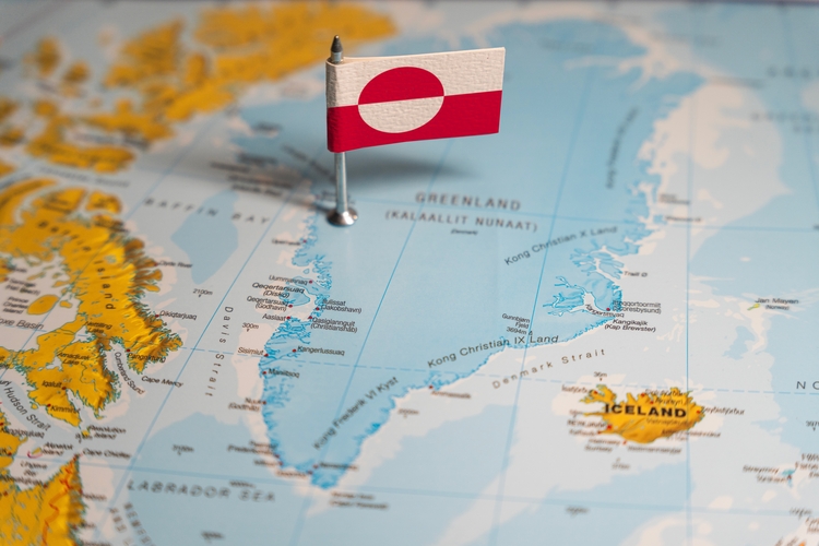
Is Greenland really as big as it seems? Find out more about its true size with five maps that might change your perspective…
By
On a standard Mercator map, Greenland appears to be a similar size to Africa. In reality, the world’s largest island is around 14 times smaller than the continent.
Such glaring disparities, some critics argue, are lost on President Trump, who has dubbed Greenland as ‘massive’ and makes continued references to it adding sizeable bulk to America’s landmass if he were successful in acquiring the nation.
For perspective, Greenland is larger than France, Germany, Spain, and the UK combined. It’s also larger than the state of Alaska but smaller than the contiguous United States.
Clearly, Greenland’s size – around three times that of the state of Texas, stretching for 836,000 square miles – can easily be misjudged. So, here we’ve rounded up five maps to get a true sense of scale of the icy island making headlines around the world…
1) Gall-Peters projection
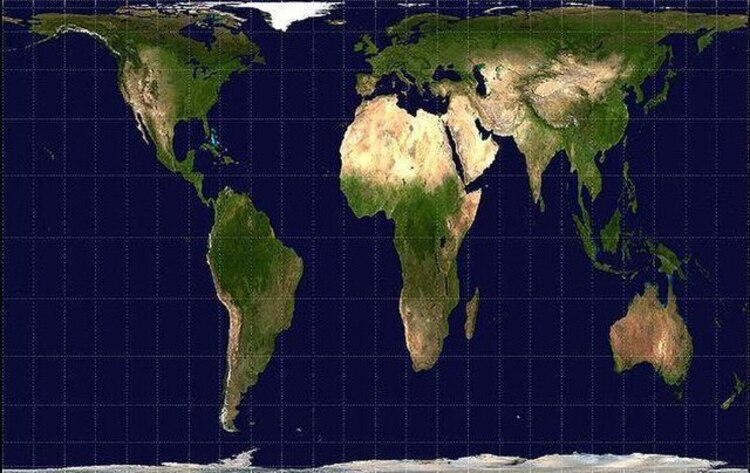
In the Gall-Peters projection, areas are depicted with the correct sizes compared to each other in a model known as equal-area. Its creators, James Gall and Arno Peters, argue that the traditional Mercator projection distorted the relative sizes of regions – particularly of those near the poles, like Greenland. As such, the Mercator map was said to misrepresent the importance of equatorial regions.
However, a significant drawback of this projection is the distortion of shapes. While areas are accurately represented, the shapes of continents and countries are elongated and stretched, making the map less useful for navigation and general geographic understanding.
2) Orthographic projection

An orthographic projection is the best approximation of a view of the earth from space, and creates an illusion of a three-dimensional globe. Here, we see Greenland highlighted in green.
The projection is first believed to have been developed by the Ancient Egyptians and Greeks.
Orthographic projections only show a portion of the earth at any given time, with cartographers able to use this projection effectively to highlight a particular view of earth.
This projection is perhaps one of the most compelling in showing the geopolitical importance of Greenland. Sandwiched between the US and Europe – and in Arctic waters – the territory is well placed for early warning systems in the event of missile attacks, and for monitoring vessels in the region.
3) Equal Earth projection
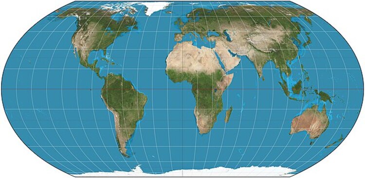
The Equal Earth map shows countries and continents at their true sizes relative to each other. Unlike Mercator maps which make it difficult to visualise, it’s clear to see here how Greenland is 14 times smaller than Africa.
It also puts into perspective how many countries can fit into Africa: you could fit China, United States, India, Japan, Mexico and much of Europe into Africa, with still room to spare.
4) Mollweide projection
Back in 1805, German mathematician and astronomer Karl Mollweide created the Mollweide projection. It represents the globe as an ellipse, preserving the relative sizes of landmasses and oceans while distorting shapes – particularly near the poles and map edges.
5) Dymaxion projection
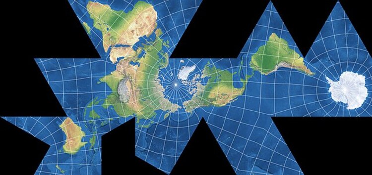
The Dymaxion Map – also known as the Fuller Projection Map – is the only flat map of the entire surface of the earth which reveals our planet as one island in one ocean, without any distortion of the relative shapes and sizes of the land areas.
Such a map helps to reinforce global connectivity – as traditional Mercator maps reinforce elements that separate humanity, causing it to appear remote or disassociated.
It helps to remove any confusion about the sizes of countries, such as Greenland – which in other map projections can appear to be almost 60 per cent larger than its relative global size.


