Passions run high on the best way to map the New York City subway, the world’s most complex subway system
By
A heated debate is underway at New York’s Metropolitan Transportation Authority (MTA) over the next stage in mapping the city’s subway system. The authorities face an extremely complex task, given the way in which a veritable spaghetti bowl of intersecting lines shares the system’s tracks and the need to explain visually the operation of local and express trains, among other transport conundrums.
On one side of the negotiating table sit the advocates of a diagrammatic approach; on the other are those calling for a geographical display. Should each end-to-end route be depicted in a single colour, or would it be better to go for alternating blocks of colour?
The planners’ views reflect divergent philosophies of communication and graphic design. Should there be a minimalist approach, restricting the map to information that will help a subway rider travel from point A to point B? Or, on the other hand, would it be preferable to produce a holistic guide that shows the relationship of New York landmarks to the stations?


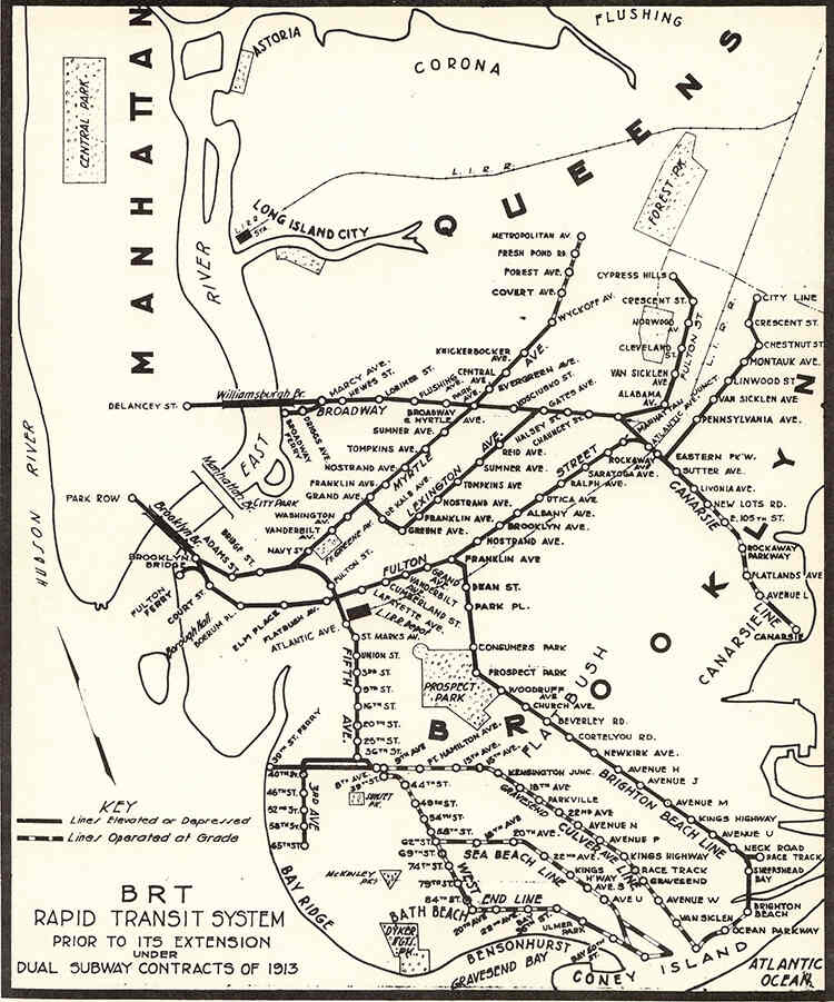
This was a simple matter until 1940, when the Board of Transportation, as it was known until 1953, decided to amalgamate the three companies that ran their own trains on the city’s 400-kilometre commuter network. These were the Interborough Rapid Transit (IRT), the Brooklyn-Manhattan Transit (BMT) and the Independent Subway System (IND). The three companies opened between 1904, the year the subway began to operate, and 1932. There was very little, if any, cooperation among the operators, which were, in fact, rivals competing for passenger traffic on their respective carriages. Each had a map that showed only its own routes, and there were few stations at which a commuter could transfer free-of-charge from one line to another.
It was an illogical system, as the BMT and IND lines were longer and wider than those of the IRT. This meant that BMT and IND trains couldn’t fit into an IRT tunnel. An IRT train could fit into a BMT or IND tunnel, but since it was narrower, the gap from car to platform was deemed unsafe. The BMT and IRT went bankrupt in 1940, forcing a municipal government takeover of their lines. Many of the elevated lines were taken out of service and thus began the gradual unification process, with the establishment of free transfer points between divisions.
‘Things were simpler before unification,’ says New York historian John E Morris. In his book Subway, Morris traces the history of the network over its 120-plus years of service. ‘In theory, the three systems were unified in 1940,’ says Morris, ‘but it took the Board of Transportation three years to issue their own map showing all three lines.’ It wasn’t until 1943 that the Hagstrom Map Company was awarded a contract to produce and market a pocket map that displayed all three networks on a single page.
In 1933, improvements in printing technology enabled Andrew Hagstrom to create very clear maps with three colours for subway lines. This Hagstrom style dominated the subway map market for several decades.

The New York subway is arguably the world’s most challenging mass transit system to depict in an uncomplicated map design. The task requires explaining in easy-to-follow graphics how to navigate crossover lines, some of which stop at all stations and others that whizz through from one express station to the next and those that don’t operate on weekends.
Once the three original rail companies were merged, Board of Transportation planners began addressing the challenge of placing the subway’s 472 stations – 200 more than London and well in excess of any network worldwide – into an easily readable format. This was largely achieved by borrowing European design concepts.
In 1933, London Transport draftsman Harry Beck produced a diagram of the city’s Underground routes. ‘Most modern subway maps around the world trace back to London’s,’ says Morris. ‘It was simple, abstract and brightly coloured. It dispensed with geographic reality, placing some stations out of position relative to others for the sake of simplicity and elegance.’ With updates, this remains the basic guide for the London Underground. Resembling a circuit diagram more than a map, it became the template for transport cartographers from Berlin to Bangkok.
In 1998, transport historian Peter Lloyd was gifted a 1958 version of the London map held together with Sellotape. This aroused a deep-rooted interest in urban transport maps, which he began to collect online. Today, Lloyd is acknowledged as a leading authority on the history of the New York subway map.
‘Hagstrom’s 1936 map was the first to introduce individual colours to each of the three trunk lines: IND, BMT and IRT,’ says Lloyd. ‘It was a geographical map that gave people the geographical position of subway stations in the city, embedded in a matrix of topography. This had certain advantages, particularly in the 1970s, when New York was on the verge of bankruptcy and criminality was rampant in many areas of the city. A passenger would not necessarily want to alight in a neighbourhood with a high crime rate.’

In 1955, the German-born, British-trained typographer George Salomon introduced the abstract approach to New York subway mapping. His proposal to the Transit Authority (TA) for a replacement of the Hagstrom map was accepted. The result, in 1958, was a map based on Beck’s London design – albeit an aesthetically livelier version – that placed all lines at 45° or 90° angles, with geography distorted for simplicity and surface elements omitted. There remained the problem of simplifying the legacy of the three-lines system and its hodgepodge of signage throughout the stations.
Salomon’s creation was the first to follow a systematic visual language in diagrammatic form, although the TA rejected his systematic revision of nomenclature and his version lasted only until 1969. ‘The map was deemed complicated and confusing,’ says Lloyd. ‘It lacked clear indications of how to change trains or even get from one place to another.’
That year, the TA opened the Chrystie Street Connection, a tunnel under the Lower East Side that was built to connect lines of the BMT and IND trains. For the first time, this allowed interworking between the two networks, which, in effect, meant that they were merged. It also meant the three-colour scheme that had worked well for 34 years was no longer tenable. Later, in 1978, there was some support for switching to a two-colour scheme with, for instance, blue for IRT and red for BMT and IND, but opponents argued that the tangle of BMT and IND lines wouldn’t be clear.
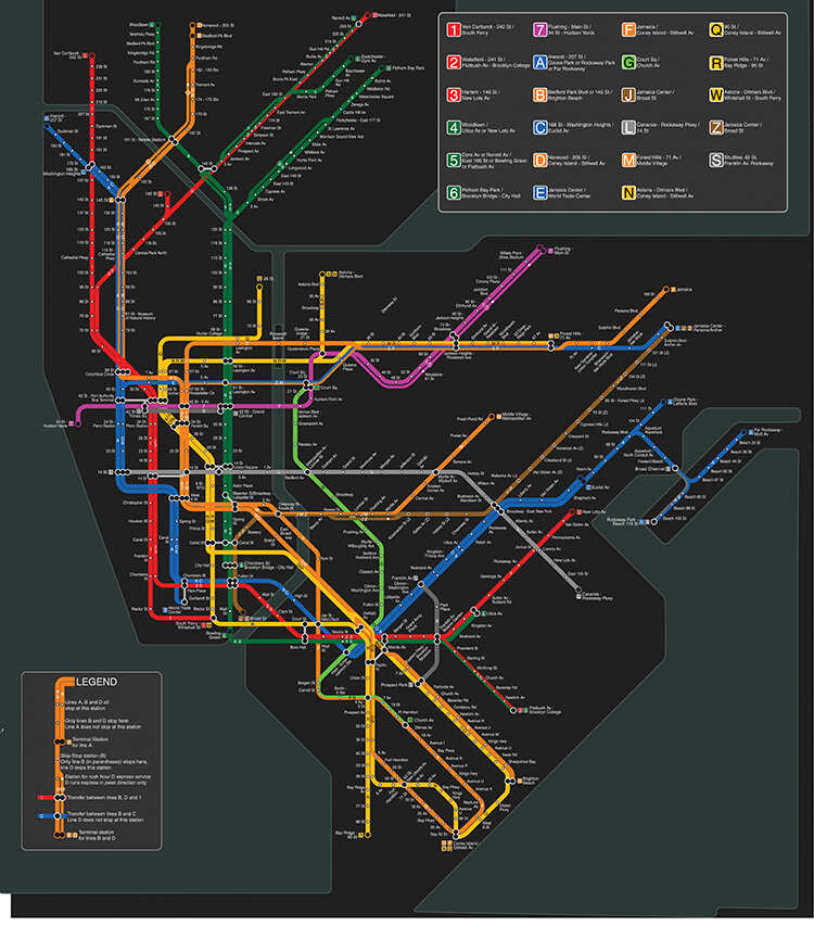
The TA opened a subway map competition and the winning concept was a geographical design illustrating each end-to-end route in its own separate colour. The result was the new multicolour map of 1967, which brought in far more visual information but lost a great deal of clarity and was deemed by New Yorkers to be complicated and confusing. This was the first representation of the subway system in which each route was shown separately. Five years later, the classic Massimo Vignelli diagrammatic map streamlined the design, but kept the same colours.

Vignelli’s work came to represent the bedrock of diagrammatic New York subway mapping. The Italian graphic designer, who died in 2014, had taken his design firm Unimark International from Chicago to New York. It was later to become Vignelli Associates, in partnership with his wife Lella. In 1970, Vignelli presented the TA with a proposal for a new map. He argued that the city’s geographical markers weren’t useful to straphangers travelling underground. The serpentine maze of solid and broken lines, interrupted by station boxes, was replaced by simple, bold bands of colour that turned at 45° and 90° angles. The subway lines became multicoloured strands running in straight contours. Each route was colour-coded, its stops indicated by black dots. Colours were also assigned to the boroughs, with the exception of Staten Island, which isn’t served by the subway system. Streets and landmarks were jettisoned, landmarks such as Central Park were distorted in size and shape, and stations were geographically shifted to fit the layout. Vignelli’s newly launched map triggered a clash that is ongoing to this day. The dispute is mainly between supporters of his London Tube-style graphic layout and the many opponents of the modernist approach that involved the elimination of geographical reference points. To make the map function effectively, a few geographical liberties were taken, something that didn’t sit well with New Yorkers. Dissatisfaction was palpable, and in 1979, the map was replaced.
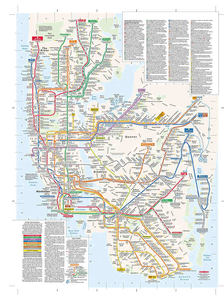
‘John Tauranac introduced a radically new trunk-coloured approach to mapping,’ says Lloyd. ‘Tauranac was appointed chairman of the Subway Map Committee, set up in 1975, which, four years later, came up with a geographic map using a trunk-based colour scheme that Tauranac had been single-mindedly pursuing for several years. Assisted by Nobu Siraisi of Michael Hertz Associates, Tauranac’s committee created a clear but informative design that has lasted 45 years and is still going strong.’
Tauranac says: ‘In 1978, we received the blessing of the MTA chairman, which enabled us to move forward with a new colour-coding system based on trunk lines that paved the way for a more geographic representation of the system.’ This bundled together all the routes that shared the same trunk. Tauranac was the creative director of the map that ended the MTA’s 20-year experiment with diagrammatic versions that showed the topology of the subway network but dispensed with most of the above-ground topographical detail.

The subway map is a subject dear to the hearts of New Yorkers, to the extent that in that same year, the MTA conducted a poll under the banner ‘If you don’t like our new subway map you can tell us where to go’. The initiative arose from a subway retrospective organised by Tauranac at a gallery exhibiting the MTA’s latest prototype map, along with the consultation to solicit public opinion on the experimental red-line only design, intended as a replacement for the Vignelli map. The results showed that a majority liked the addition of geographical detail, while almost everyone disliked the use of a single colour for the subway lines.
A year later, the result was the 1979 MTA map, which had geographical details but trunk-coloured subway lines.
The Vignelli versus Tauranac concepts of mapping the New York City subway have been a hot topic for decades. In his forthcoming book, A History of the New York City Subway Map, Volume 6: Geography Bites Back, Lloyd recounts how rancour and animosity reigned supreme on opposing sides.
As early as 1978, Vignelli and Tauranac went head-to-head in a public debate in the Great Hall at private college Cooper Union. ‘However well-intentioned the event was in its conception, in actuality it was more like a stormy irruption between two battling air masses than a real exchange of ideas,’ Lloyd says.

The main thesis of Tauranac’s talk was that the subway map must be integrated with topographical information, just as the subway itself is embedded in the city. This was the opposite of Vignelli’s doctrine – that the subway map should be purely a no-frills ‘machine for navigation’. Tauranac wanted a single map that would endeavour to deliver all the data needed for navigating the subway, which included a distinction between full-time service at a station versus part-time service, that there should be a graphical distinction between express and local stations, as well as basic information to assist the traveller on foot. He put forth a third function that neither of Vignelli’s maps would do, namely to show the network of subway stations in relation to neighbourhoods and landmarks in the city. Besides these functional requirements for the map, Tauranac had a deep, visceral hatred of the Vignelli map and a corresponding yearning for a return to the halcyon days of the Hagstrom rendering. Tauranac believes in what he describes as the ‘cartographic verities’ – that parks should be depicted as green, not grey, and that water should be portrayed as blue, not beige. His conclusion is that the Vignelli map was a representative of the Bauhaus School, which advocated that less was more, resulting in a depiction of the system operating in a void. Tauranac’s approach was more Beaux Arts School, which advocated a more classical setting with a philosophy bordering on ‘more is not enough’..
The passions aroused by the subway map debate haven’t subsided since the Cooper Union confrontation of 1978. Tauranac recently took aim at the MTA’s current map, which he points out only depicts the operation of the subway five days a week, as if weekend riders don’t count, and doesn’t depict the late-night service that operates in normal times, short of the same kind of misguided information found under the rubric identifying variations in service.
‘The difference between daytime service in normal times and late-night service is the difference between night and day,’ Tauranac says. ‘However, MTA passengers are only told that at night, the N, for instance, is operating “Local, via Financial District.” That statement provides no hint as to how the N gets to the Financial District, since how can the uninitiated be expected to know that the N takes the Manhattan Bridge?’

The MTA is now toying with the idea of returning to the diagrammatic approach and has started to test people’s responses to what can be regarded as a Vignelli progeny. Tauranac is unsurprisingly less than delighted with the prospect of turning the clock back on subway mapping. He says, ‘If you use the phrase reductio ad absurdum only once in your life, in its literal sense of leading to an illogical or absurd state, and you use it to describe the 1972 [Vignelli] subway map and this offspring, you will have done the phrase justice.’
Traditional subway maps aren’t invulnerable to the digital age and its plethora of apps. Peter Lloyd says the MTA has an app that, in the opinion of MTA rivals, isn’t well developed and isn’t very popular. ‘About ten years ago, the MTA’s stated policy was to encourage third-party apps rather than develop their own, as they wanted to focus on the core business of running the subway rather than developing the skills to build apps,’ he explains. ‘Since then, they have changed their mind and launched MYmta, an acronym for MTA’s Official All-in-One App.’
The last paper subway map was issued in February 2020. Production was paused for the Covid lockdown and to this date hasn’t restarted. The MTA displays its map electronically on the internet, on station platform panels and on the phone app. ‘The move to electronic maps is hampered by the cost of the station displays – about US$5,000 each – the ease with which they can be vandalised and, most importantly, by the possible screen resolution,’ says Lloyd. l


