Stephen Webb boldly challenges our perceptions and explores the world through maps and data
Review by Mark Rowe
‘All maps lie’ is a bold premise upon which to base a book that uses maps and data visualisations to interpret the planet upon which we live. You may deem this even more admirable because it comes from an author, Stephen Webb, who’s one of those academics tireless and determined enough to continually challenge the anti-vaxxers and the climate change deniers, to pursue those arguments that rational people can never win.
Webb’s point is that those who discern conspiracy where the rest of us see science tend to have one thing in common, they refuse to accept that human activity can have an impact on the globe. In this fluent book, Webb looks at the world in 80 ways, using maps to show just what we are doing to the planet. Taken together, the maps paint a picture about the physical world and how people live on and affect it.
Webb, a physicist from the University of Portsmouth, patiently explains that replicating a three-dimensional sphere (the Earth’s surface) onto a two-dimensional space (such as the page of a book) ‘is mathematically impossible to do without distorting something… no map is truly truthful’ (Webb points out an obvious example, that the bottom of most maps implies Antarctica must be the Earth’s biggest continent, its land mass sprawling across the Earth’s full width; in reality Antarctica is only the fifth-largest of the seven continents). Flat Earthers rejoice? Not so fast: the question is, asks Webb, ‘what distortions are we willing to accept and what features do we want to preserve?’ Maps still can tell us things that are true, meaningful and insightful.
Historical and contemporary maps are deployed. A popular example he turns to is the convention that north should appear at the top of a map. ‘We could just as easily adopt the opposite convention,’ he notes. ‘This “upside-down” view… looks wrong. And yet it’s as valid as our usual representation.’ In medieval Europe, before explorers adopted the magnetic compass, most mapmakers put east at the top, simply because the rising of the sun provided an important bearing.
The book splits the world by themes of human geography, from maps showing where the gender gap is wide or narrow (where women and men have parity, the gender gap is deemed to be 100 per cent closed; spoiler alert: no country achieves 100 per cent), to capital punishment, plastic use to renewable electricity, the dominance of capital cities, literacy and homes at risk from rising sea levels. The map of the global distribution of malaria deaths, sub-Saharan African nations leaping out of the page, is shaming.
Several maps are quirky but still tell us something. The plotting of UFO ‘sightings’ shows how remarkably skewed these are to the USA and Western Europe, the inference being that, rather than aliens having a disproportionate interest in Western civilisation, some parts of the world are just more sensitised to the concept of UFOs and have the means to report them. Occasionally, the accompanying text is a little flimsy or screams out for more; the map of per capita alcohol consumption frustratingly doesn’t elaborate on why Nigeria is right up there with Germany when it comes to boozing.
Webb’s skill lies in provoking thought from what may sometimes strike you as topics for the pub. Ever wondered what is the longest straight line you can walk without getting your feet wet? The answer is far from straightforward and depends on how practical you want it to be, and whether you’re prepared to roll your trousers up. The longest in theory may be the journey from China via Jordan to Liberia (13,589.31 kilometres) but the natural barriers – mountains, rivers, deserts and extremes of heat – are formidable; the political situation within and between several countries along the route is also dire and probably insurmountable. The rival route, from Sagres in Portugal to Jinjiang in China, although 1,831 kilometres shorter, is more practical.
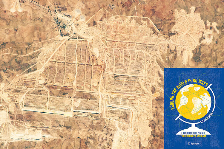
The long walk map tells us something about how geography bumps into politics; other maps make salient points about human impacts. Why compile a global map of phosphorous? Simple, argues Webb: given the element’s role in our DNA and RNA, no phosphorus equals no life. Phosphorous also happens to be rather scarce, something that matters should we look at a map: more than 70 per cent of global phosphate rock reserves is found in Morocco and Western Sahara, where the longest conveyor belt ever built takes white phosphate rock from desert mines to the coast. But Western Sahara is disputed and so a critical resource lies in a region of significant political tension.
The index – a feature not often included in such books – is welcome, allowing readers to cross-reference themes of interest and jump around in the best tradition of map-hopping. The dynamic nature of many trends means a second edition, updating maps in 30 years’ time, might be instructive. A malaria map of 2050, as the climate warms and mosquitoes spread north, would make for striking reading.
The ‘alternative facts’ of political rabble rousers and social media trolls remain a gnawing, serious problem. More knotty but probably more pertinent in the long-term, as this thought-provoking book makes clear, is how we choose to interpret facts that have been literally mapped out; how we make sense of what Webb calls ‘the messy reality of planet Earth’.


