Alastair Bonnett talks about his latest book, 40 Maps That Will Change How You See The World – and why we are living in a golden age of mapping
Interview by Graeme Gourlay
One of the first ideas that Alastair Bonnett wants to dispel is that we live in an age when maps are becoming less important, that we don’t use them and we barely understand them.
‘Quite the opposite,’ says Bonnett as we talk about his latest book, 40 Maps That Will Change How You See The World. ‘That idea is for the birds. There’s a mapping revolution going on. The power of maps and the amount of data they can manipulate are exponentially increasing. It’s a golden age for maps. They now tell so many different stories – really important stories.’
Perhaps the next thing to get out of the way is a definition of what a map is. As Bonnett points out, there is a basic human need to organise outside reality, and maps are clearly part of that process. He says: ‘A map is a representation of a territory, a spatial representation of territory that has a function, and that function is to guide us.’
However, that function isn’t just a simple route map to aid a journey or to lay out political boundaries. Maps, as his fascinating selection reveals, can have many more purposes and functions.
Enjoying this article? Why not check out our other related reads?
They can be a window into the past. One of the earliest included in the book is a Chinese map from 1137. It covers thousands of kilometres of east and south China and was carved on stone in stunning detail on a grid matrix hundreds of years before the method was incorporated into Western maps.
It shows the sophistication of bureaucratic administration already established and highlights the importance of China’s great rivers in the region’s history. Most impressive of all, the stone was, in fact, a printing press, so copies of the map could be distributed around the empire.
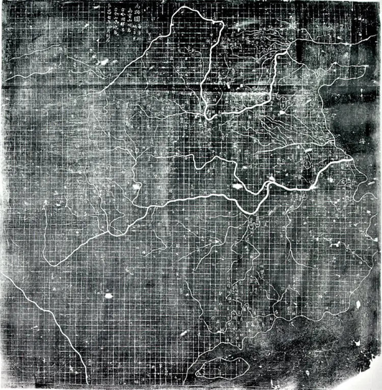
Above: The intent of this 12th-century map is recognisably scientific. The land is divided into grid squares and towns, coastlines and rivers are placed not by tradition or educated guesswork but according to rational methodology. Carved in stone, it’s a printing press, part of a sophisticated and co-ordinated process to disseminate knowledge.
This is incredibly advanced,’ Bonnett points out. ‘Unlike maps in Europe in the 12th century, which had no or little functional quality to them, this is stunning. It is a work of mass communication.’
One of his favourite selections in the book is a beautiful, Burmese, teardrop-shaped map that gives a highly detailed and complex spiritual worldview. ‘It takes the idea of the map and our expectations of what a map can do, what a map is, and pushes it into a different direction,’ he explains. ‘This is a spiritual map. We often think of mapping as an extremely rational exercise, but it can go in all sorts of different directions. There’s no reason why spirituality and mapping can’t come together.’
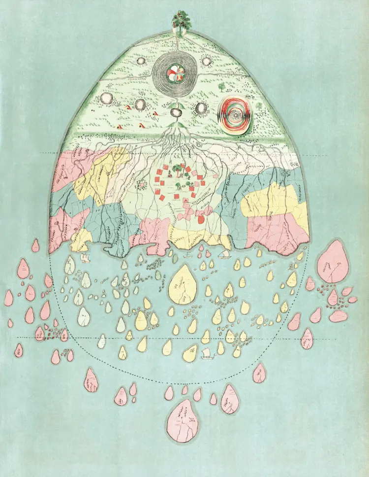
Above: The world as a shattered teardrop, coursed with rivers and breaking apart into tiny islands, and on the top of this stands a single green tree. This map takes us on a journey, not just across a physical distance, but to a different worldview. It shows the world as the Burmese would have known it in the 18th and 19th centuries.
The map first appeared in print in 1906 in a book compiled by the English colonial governor and folklore enthusiast Sir Richard Temple. Its date and author are unknown. The map does contain topographical information such as rivers, mountains, lakes and islands, but it combines it with a Buddhist cosmology, revealing a very different way of seeing the world.
Bonnett says: ‘This extraordinary shattered teardrop for a Burmese audience would have enabled them to imaginatively position themselves in South Asia, and to see at the centre of their world Buddha and enlightenment.’
A more contemporary map, but one that provides an equally radically different worldview, is the surprising vertical world map created by Hao Xiaoguang in 2013. This map places China at its heart and reveals the close physical proximity of the nations in the Northern Hemisphere.
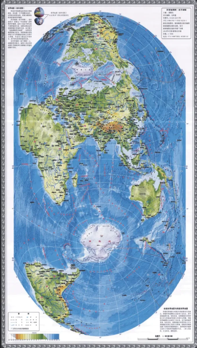
Above: World power is shifting, and cartography is a servant of power. This Chinese map puts Asia centre stage. The most alarming thing about this vertical map is the way that it represents the poles as accessible and exploitable. It has been estimated that about 22 per cent of the world’s undiscovered oil, gas and valuable minerals are within the Arctic Circle.
‘Some maps being produced in China today are propaganda,’ Bonnett argues. ‘They show China encompassing all of the Pacific. But I don’t think this is propaganda in any crude sense. It is a genuine attempt to cartographically reimagine and think about the world and show how close the various parts of the Northern Hemisphere actually are.
‘People looking at the traditional Mercator map often find it hard to grasp that it is obviously far quicker to fly over the North Pole to reach North America from China. Not with this map.’
Bonnett also points out that as well as repositioning the Northern Hemisphere in our minds, the map also puts Antarctica into play. He fears that this shift of the white continent from the furthest fringes of our cartographical imagination indicates the Chinese may well see it as being ready for exploitation, and they should be in on the game.
He says the map reveals that the current status quo of Antarctic access laid down in the 1959 Antarctic Treaty may not be sustainable if the rising powers of China and India feel they are being excluded.
One of the most exciting branches of cartography today is bathymetry. The United Nations’ Intergovernmental Oceanographic Commission produced a novel way of viewing the world’s oceans – or ocean as they rightly point out– in 2022. The map below clearly shows the interconnection of the oceans that make up our blue planet. It also shows the sheer scale of the water that covers most of the Earth’s surface.
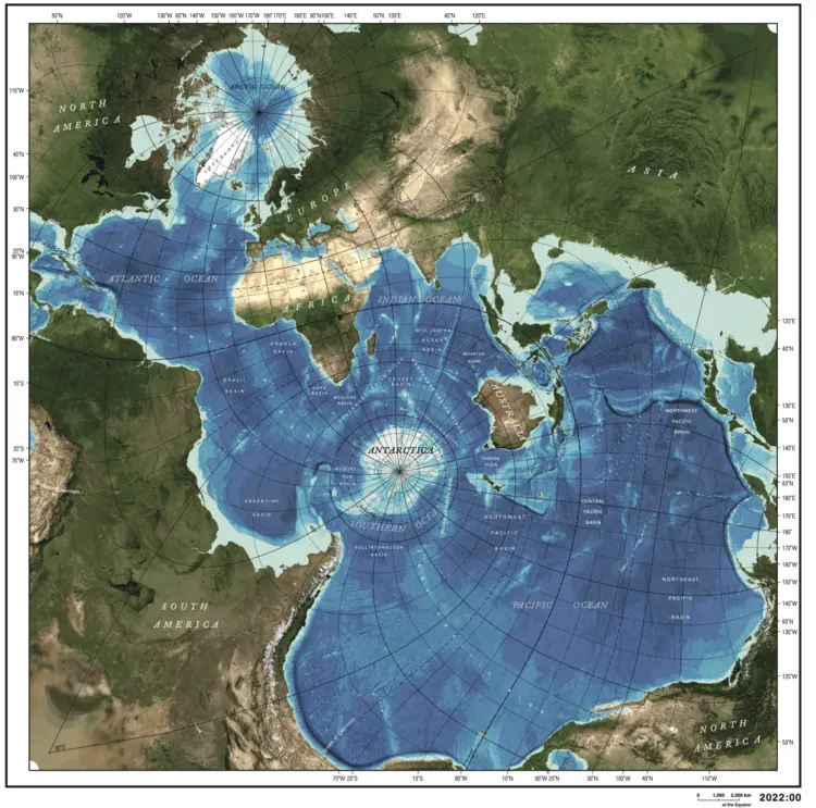
Above: The world is two-thirds water. It’s one of those facts that’s easy to repeat but hard to grasp. That’s why this map is a revelation. It does a simple thing – it recentres our point of view – and in doing so, it turns our world upside down. Now we can see not only how watery the Earth is, but how the oceans are connected.
‘It’s a powerful message,’ Bonnett says. ‘Bathymetric scientists have pulled together what was actually quite a lot of scattered information about the sea floor. This map is one of their statement images. We all know the world is two-thirds water. But it is time we started to take that seriously. And one of the ways they’re trying to make us take that seriously is by saying there is no Atlantic Ocean or Indian Ocean or Pacific Ocean – there is just one ocean. It’s all connected. One ocean, one planet.’
Until relatively recently, charting the ocean was a laborious task involving ships crisscrossing the seas and taking readings with sonar. Hence, we knew next to nothing about the geography of the ocean floor as less than 20 per cent had been accurately mapped. However, satellite technology now allows us to map vast swathes using anomalies in gravity to put the pieces of the jigsaw together. It’s hoped that we’ll have a full and freely available global map of the world’s seafloor by 2030.
This golden age of mapping also reaches into space. Not only are there now images allowing astronomers to create awesome maps that show our galaxy’s position in the expanding universe (the Laniakea Supercluster, the last map included in the book), which truly boggle the mind, we can now produce maps of Mars as detailed as a tourist guide to France.
One depicts the largest mountain in the solar system – the Olympus Mons Caldera, which is a gasp-inducing 26 kilometres high. The remarkable map was produced by the USGS Astrogeology Science Center in Flagstaff, Arizona, in 2021.
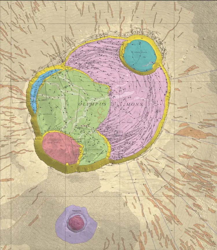
Above: This map of Mars is the most detailed we have. The bright colours highlight the different ages and formation of what is the largest mountain in the solar system – Olympus Mons, 26 kilometres high and covering an area the size of Poland. The two smaller round shapes at the bottom of the mountain are where it has collapsed into itself.
‘This is a really dramatic map’, Bonnett says. ‘It is of a scale that you would use for a car journey across Europe, and it shows something extraordinary – a volcano the size of Poland that has been dormant for millennia.’
‘It’s like staring into the distant past. The detail reveals Mars was once a very active planet. Now it is desolate and dormant. There’s no reason why our Earth couldn’t also look a bit like this one day. It makes you think.’
While maps in the book will change the way we see the world, they also make you question how all this information-gathering is changing us. Much is to our benefit, such as the understanding of the health risks of excessive noise. These can now be tracked by a growing bank of acoustic mappers. Epidemics can also be mapped like never before.
But not all information organising is inherently benign.
Bonnett says: ‘We are all being mapped, being located. Not only are we using maps a lot more on our phones, but we are being mapped. Our location is known, and that information is being transmitted. We are little data points, so it isn’t clear whether we’re in control or whether, in fact, we’re just being sort of shoved around, you know, being led around the board.’
He points out that all of the benefits of an information society should be balanced with an awareness of the risks that gathering such a plethora of personal data entails. The hive society could be very different from the world of personal freedom we think we inhabit. He says: ‘It is important for people to start talking about the implications of that, and to start taking such things seriously.’

